
Allcare
The only insurance app you need
BACKGROUND
Format Solo Project
Prompt Solve a classmate’s problem
Time 3 Weeks
Challenge
There isn’t a unified system or platform where insurances subscribers can manage their health, dental or eye insurance in one place.
When looking for care, patients tend to conduct research on various platforms, jumping between their insurance app, google search, or yelp. This becomes a bigger pain when patients switch insurance provider, due to job changes, moving, for better value, or other life circumstances.
Solution
A consolidated Insurance app that enable users to manage all their health insurances in one place and find care that’s covered by their insurance.
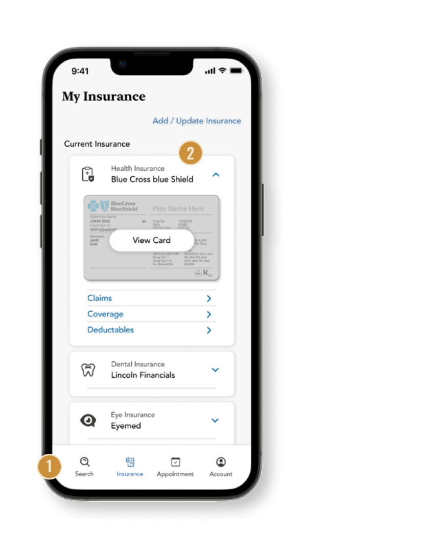
All your insurances managed in one place
Design Considerations
Fixed position bottom nav bar - guide users to finish tasks quickly and easily in this task driven app.

Collapsable Insurance details - Protect users’ privacy and let users to present only needed info when visiting doctors’


Find care easily under your insurance
Design Considerations
Quick filter options - Let users quickly filter for “In Network” doctors/care. “Filter” dropdown menu is then annotated with “1” so it’s clear this is a filtered search result lists.
A common criteria users care about when seeking care is “how close the doctor is to me”. Map view helps visualize the distance.

Keep track of appointments
Design Considerations
“Appointment” is in fixed position nav bar - Easily pull up the appointment and find relevant info.
Notification to remind users their upcoming appointments.

1.
Simple & guided sign up process
Design Considerations
Why layout each sign up step? - The topic of insurance often reminds people of tedious experience, a quick guide set the expectations for users.
Info Pop-up Window - To help user feel at ease when providing critical and confidential into that ultimately solves their problems and pain-points (Having to adapt to multiple insurance apps etc)
Initial Assumption
For this project, we were paired with a fellow classmate. We shared with each other a problem we have in our lives, and we need to find a design solution that address our pain points and help solve our problems.
My paired partner mentioned they had a hard time using their Cigna insurance app. They had just moved back to the States and this is a new insurance subscriber she had. She preferred her old insurance app from United Health, but since she switched insurance, she’s now stuck with this app she didn’t like.
I assumed since my classmate was having a bad experience with the Cigna app, lots of other people would to. I thought, the solution is simple —— If I redesign the Cigna to improve its user experience, it would solve my classmate and many other Cigna users problem.
As I continued my user research, I realized my assumption and the project direction was wrong!
User Interviews & Insights
Users switch between multiple platforms and communication methods to obtain key information needed to choose a healthcare providers, which is time consuming and tedious. This gets worse when they have to adapt to a new platform when switching insurances.
Method Virtual user interviews with 5 participants.
1.
Users switch between multiple platforms (Insurance app, insurance web portal, Google, Yelp, phone calls) to obtain key information needed to make an informed decision
“Medical care is expensive, I want to make sure I’m not paying a million dollars for a simple procedure.”
3.
Users often need to adapt to new and different insurance platforms
“I usually start my search on Yelp or Google, then I call the office to make sure they accept my insurance.”
2.
Users most care about below when looking for care: Whether the doctor is in network; Cost; Reviews & Reputation
“I liked my old insurance’s app, this new one is hard to use”
Project Pivot Point
The insights drawn from user interviews made me realize re-designing the Cigna’s insurance app won’t solve all the user’s problems —— There has to be a better solution.
Before I started to speak to more users, I had assumed that my classmate’s bad experience with Cigna should represent what other users would experience. However, as I conducted more and more users interviews, I would find other users love Cigna app. They switched insurance from another provider to Cigna and absolutely love the new app!
At this point, I already spent 1/3 project time working on redesigning the Cigna app. Needless to say, it’s stressful to realize that may not be the right direction after all.
Following all the user interviews, an idea sparked in my head - instead of re-designing Cigna’s insurance app, the pain points emerged when users changed insurance providers. Re-designing one insurance provider’s app might temporarily address this pain point, but understanding how frequent users change insurance, it is only a temporary fix. Once the patient change insurance, they might have to deal with an app that’s not intuitive or helpful.
An alternative solution needs to be in place to address this problem.
PERSONA + USER JOURNEY


Competitive Analysis
There is not a consolidated insurance app that auto-sync’s to a user’s latest insurance subscriptions and allow them to seek care under their insurance coverage and manage appointments.
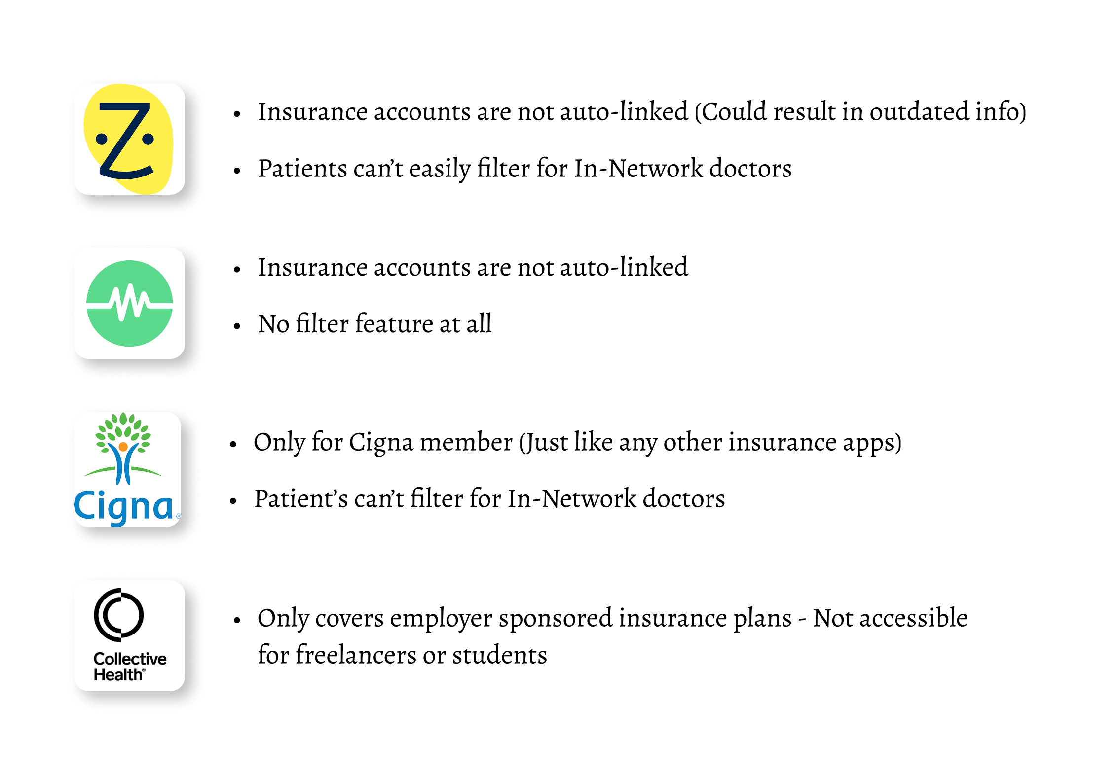
There are 995 health insurance companies in United States. Changing insurances and physicians is common. Each time a consumer changes insurance they have to adapt to a new insurance app.
Industry Analysis
Health insurance is a highly fragmented market. According to Insurance Information Institute, there were 995 health insurance companies in United States.
The fragmented health system places great burdens on patients. According to a survey done by Finn Partners, half of consumers surveyed reported to have changed health insurance and physicians every three years.
This means, consumers who manage their insurance plan through mobile apps(Find care, book appointments, track co-pay, and various any other tasks) will need to adapt to a new insurance app every three years or more often, depending on the circumstances.
I created multiple iterations of the initial idea after testing.
Testing & Improvements
Method 5 moderated usability testing with 5 participants. Testers were given 4 tasks to complete.
Results Multiple iterations and design changes were done based on the feedback and observations from users’ behavior.

Below are the major improvements after all the rounds of usability testing is done.
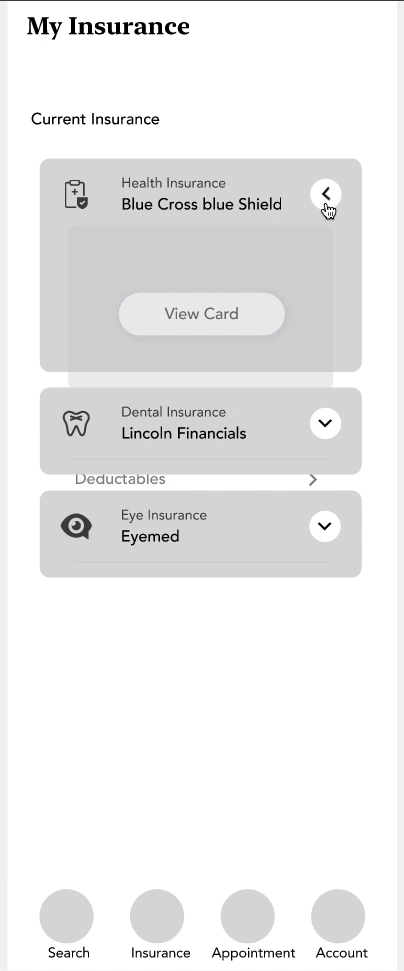
1.Search feature

→

Why was this design changed?
Participants were confused with the initial screen. They were expecting to have a preview of some search criteria like “Type of Care” and “Location”.
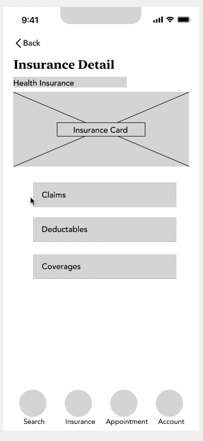
2. Insurance Card page
→
Why was this design changed?
Participants mentioned it could be confusing if they subscribed to the same insurance for health, eye and dental.
A collapsed view avoids this confusion. It also allows users to present only relevant insurance card easily, when visiting the doctor.
3. Finding available appointments

→

Why was this design changed?
Participants expected a calendar view when they are completing the task of “booking for an appointment with their doctor of choice”.
The calendar view helps the users make easier decision as the dates and availability are laid out in weekday format.
Final Prototype
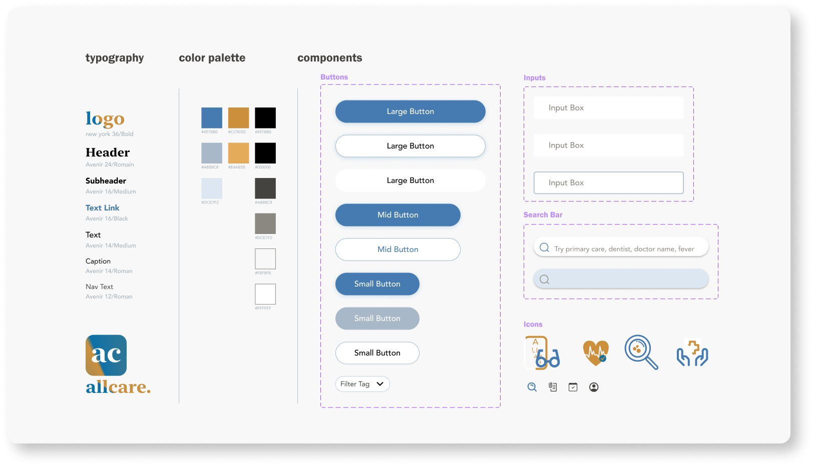
Style Guide
Lessons Learned
Keep an open mind when doing explorative research.
This was my first UX project. I decided on the project direction way too soon, and that resulted in me spending a third of the project sprint time working on the wrong solution (Redesigning Cigna’s app). I had to work overtime and put in extra effort complete the project on time. I learned the importance of finding actionable insights after all the user interviews are completed In the future I will definitely not make design so fast and so early.
Have a project plan but be flexible
I created a Gantt Chart for this project to keep track of all the scheduling, meetings, and deliverable dates. It’s helpful to visualize the timeline, which I benefitted from, but pivoting project direction certainly throw a wrench at my plan. I then quickly adapted and updated my project plan. I understood having a project plan to adhere to but re-visit frequently is key to successfully complete a project in limited timeframe.