Design Refresh + Design System
Redesigned KPA Flex’s look and feel; addressing experience problems. As the sole product designer, I led the research, design, and implementation.
Background
KPA Flex has been a key player in the EHS space for over a decade, but its design had grown outdated and inconsistent, leading to usability issues and inefficiencies.
When I joined in 2022 as the platform’s first product designer, I created and led the implementation of a new style guide and design system to unify the experience.
With low design maturity across the organization, I also drove cross-functional education to build support for design as a strategic function.
A Strategic, Incremental Approach to SaaS Redesign
Redesigning an established product meant working within real constraints—existing users, legacy systems, and limited design resources.
This is how I approached it:
Consider Existing User Base
I interviewed users and reviewed product feedback to understand the needs of those in oil, gas, manufacturing, and construction.
Design Advocacy & Education
To deliver the design refresh, I aligned stakeholders across Product, Sales, Marketing, and Engineering around the value of a new style guide and design system. As the sole designer, cross-functional collaboration was key to success.
Building Small Wins
I delivered small, visible improvements early to showcase value and gain trust.
Engineering Collaboration
I worked closely with developers to ensure seamless integration of design components.
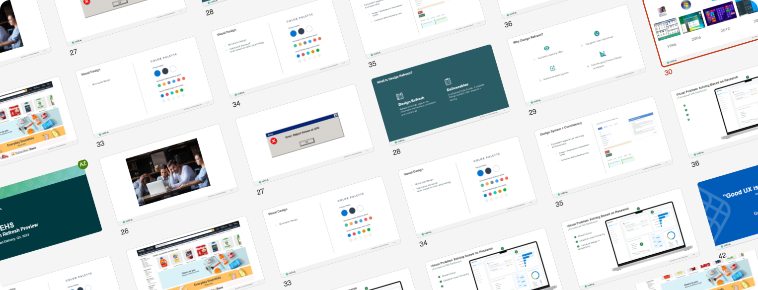
Stakeholder Alignment Presentation ExampleRedesign highlights
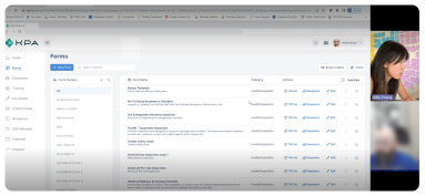
Landing page introduced streamlined navigation, clear visual hierarchy, and accessible actions, making it easier for users to find, manage, and interact with forms efficiently.

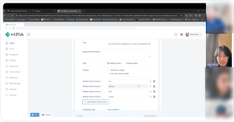
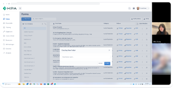
Form creation / editing experience

Dashboard
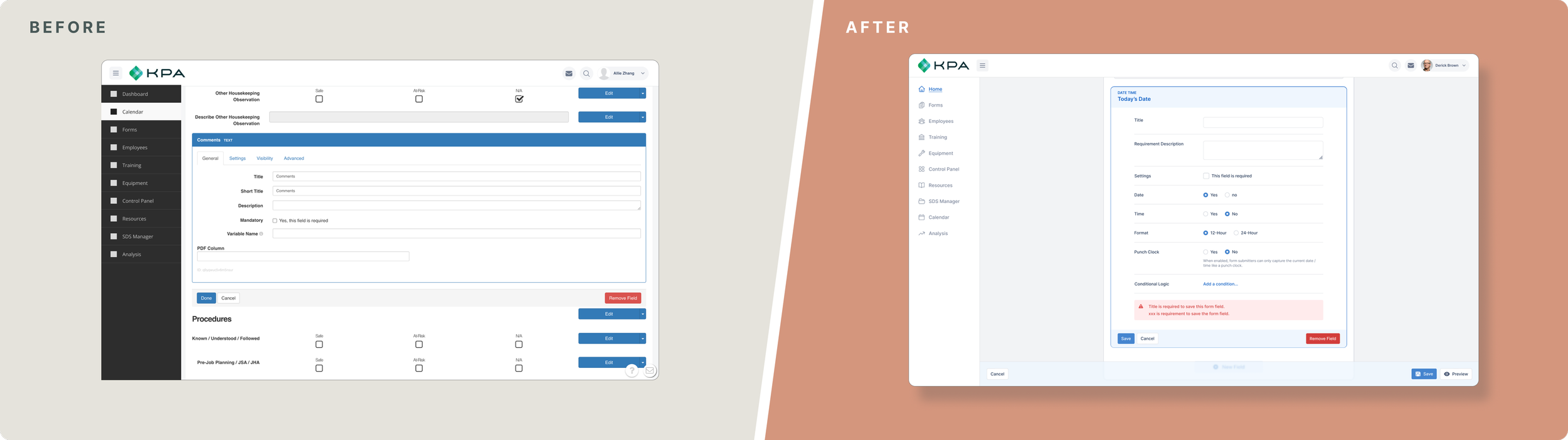
Settings for form fields
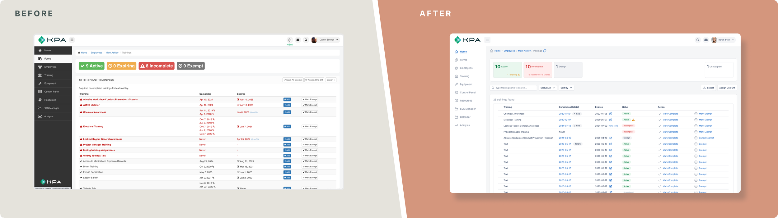
Training Status

Sign In

RMC - Home Page

RMC - SDS Sheets
UX Audit
I led a UX audit to identify inconsistencies and usability issues across the product. It highlighted key areas to modernize and formed the foundation for a scalable design system.
Snippets Of The KPA Product Audit - Flex
Snippets Of The Product KPA Product Audit - Risk Management Center
Understand Our Users
For this project, each redesigned screen and experience was grounded in user research. I conducted interviews and contextual inquiries to understand real-world workflows, pain points, and needs.
For example, with the Forms feature—one of the most used parts of the platform—I interviewed six users and observed how they navigated the Forms landing page and library. Their input directly shaped design decisions, improving clarity, usability, and alignment with daily tasks.
AFFINITY MAPPING IN MY HOME OFFICEAddressing Pain points
Again, using the Form feature as an example, I discovered and summarized below pain points through user research
1.
Confusing search functionality caused frustration, with users unable to easily locate specific forms.
2.
Cluttered layout and poor visual hierarchy made navigation difficult, causing users to hesitate and make errors.
3.
Unclear labels and confusing dropdowns led to frequent user frustration and mistakes, emphasizing the need for better guidance.
SUMMARIZING PAIN POINTS
Ideating Solutions
?
Confusing Search Functionality
How might we make the search feature more intuitive to help users quickly locate specific forms?
How might we streamline the search process to reduce frustration and improve efficiency?
?
Cluttered Layout + Poor Visual Hierarchy
How might we improve the layout to make navigation simpler and reduce user errors?
How might we enhance visual hierarchy to guide users' attention to the most important elements?
How might we declutter the interface while ensuring all necessary information is accessible?
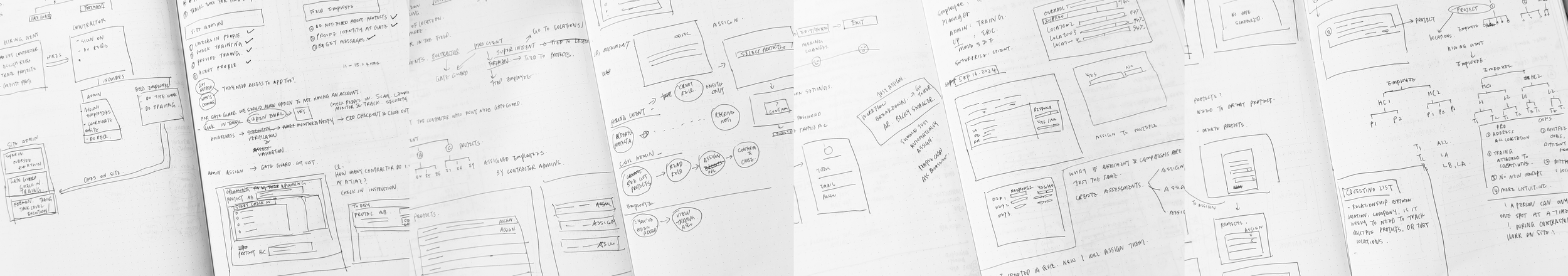
GENERATING QUICK IDEAS THROUGH SKETCHING?
Unclear Labels + Confusing Dropdowns
How might we make labels more descriptive and actionable to improve user understanding?
How might we simplify dropdown options to minimize confusion and mistakes?
How might we provide better guidance to ensure users feel confident while interacting with the interface?
RAPID PROTOTYPING FOR CONCEPT TESTINGS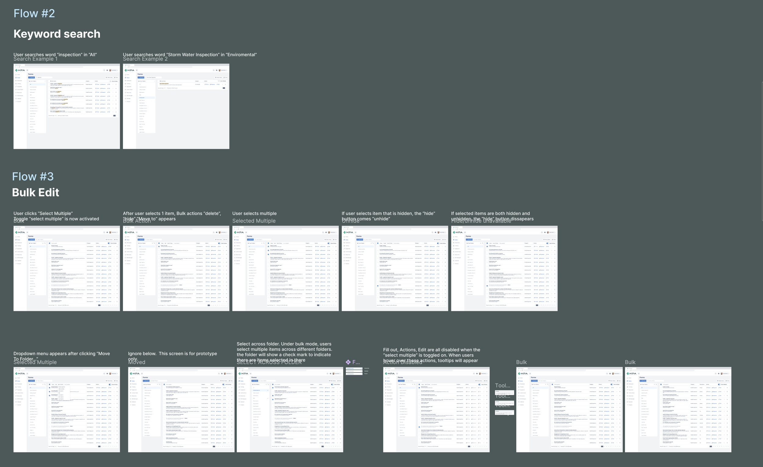
Examples of Concept and Usability TestingDesign Foundations
Color Palette
To support our product’s goal of helping users work faster and more effectively, I chose a minimalist palette to minimize distractions.
The color choices are intentional:
Blue tones convey trust, reliability, and professionalism, aligning with the safety and compliance focus of the EHS space.
Dark gray provides a neutral and strong foundation, grounding text and functional elements.
This simple, focused palette ensures clarity and enhances the user experience.
Typography & Beyond
Along with a new color palette, I defined the typography, elevations, padding and grid systems.


I worked with developers on every step of the way when creating the foundational pieces.


Outcome

Survey Feedback
78% of surveyed users rated their satisfaction with the new look as greater than or equal to 7 out of 10 (on a scale of 0-10). Some positive comments:
“It looks much more refined and visually appealing”
“Much easier on the eyes”
“I like the new colors and the ability to add a widget with the button at the top of the screen. “
“I like it a lot, much more sleek looking. “

Adoption
Development team has implemented new design components.
Efficiency - Reduced (in some cases eliminated) design / development grooming time significantly.
Usability - Screens have been updated for improved user experience.
Consistency - The design system helps creating strong product and development alignment.

Better Product / Dev Alignment
Reduced (in some cases eliminated) design / development grooming time significantly.
Usability - Screens have been updated for improved user experience.
Consistency - The design system helps creating strong product and development alignment.

Consistency
The design system helps creating strong product and development alignment.

Usability
Screens have been updated for improved user experience.
Consistency - The design system helps creating strong product and development alignment.