
Altan Insights
Investment Management Mobile App Design
BACKGROUND
Client: Altan Insights
Altan Insights is a company founded in 2020. Their goal is to democratize access to information in the alternative investing space. Altan Insights focus on providing analytics on investments in collectibles.
Project: Portfolio Management Mobile App Design
Altan Insights currently has a website platform but would like to explore options for expansion, such as a mobile app. We were tasked with understanding the desirability of a mobile app and its potential optimal design.
Timeline & Team
Timeline: 3 Weeks
Team: 3 UX Designers. My main responsibility includes project management, research & synthesizing, and concepts ideating.
PROBLEM
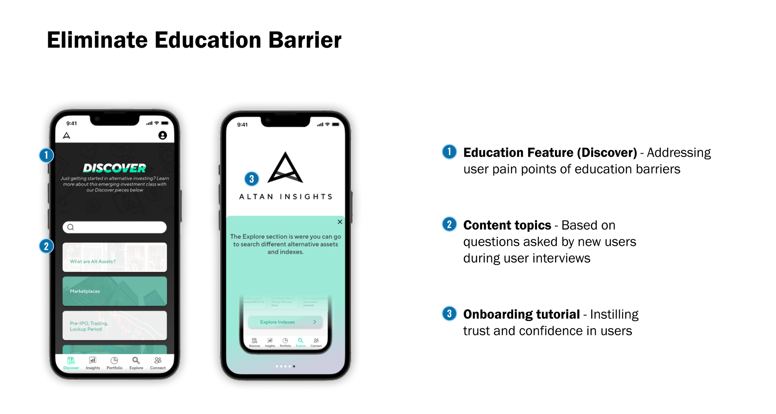
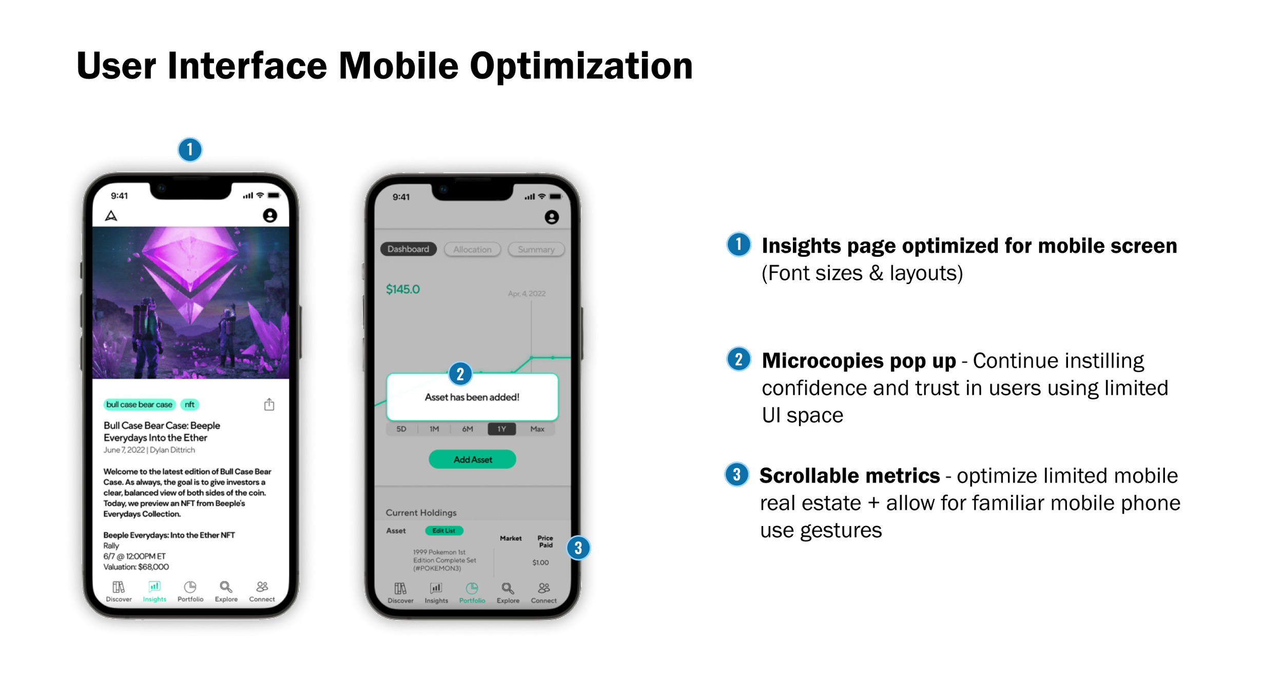
Education barrier & current web platform is not mobile optimized
There is an education barrier preventing new users from feeling confident in investing in alternative assets
The exiting platform is not mobile optimized. Existing users find it hard to perform tasks on mobile phones.
SOLUTION
A mobile optimized app that instills trust and confidence in new and existing investors where they can intuitively navigate throughout the app and easily accomplish their goals.

HEURISTIC EVALUATION
4 major areas were identified for potential improvement: user interface, information architecture, UI visual Design, and unfamiliar jargon
Research Detail: The first research method we implemented was a heuristic evaluation in order to understand the current state of the website’s mobile and desktop design. We applied Don Norman’s Heuristic Evaluation principles to guide our evaluation.
Insights: 4 major areas were identified for potential improvement: user interface, information architecture, UI visual Design, and unfamiliar jargon.

USER INPUTS & INSIGHTS
Existing users struggle with Altan’s current responsive mobile site and new users find it difficult to be educated about alternative asset investing.
Method: To understand current and potential new users’ behavior and psychology behind investing in collectibles, we conducted 9 user interviews. Our client connected us to 5 existing users and, in addition to this, we also spoke to 4 potential new users.
Insights: Three major themes appeared after the interviews were done.
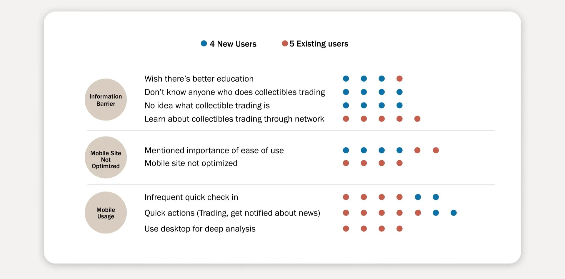
Information barrier for new investors. 4 out of the 4 new users mentioned that they do not know anyone in their network that does alternative asset trading.
Existing responsive mobile site is not optimized. For existing users, the current mobile responsive site is not optimized. Existing users mentioned their portfolio asset table being unreadable.
Users tend to use their phone for task driven activities. Younger and new users mentioned how they use trading apps like Robinhood, public, and Coinbase for trading. Experienced users mainly check on their portfolio performance and read insights.
With the right design, we will be able to enable new and existing users to achieve their individual goals.
TARGET AUDIENCE + JOURNEY MAP
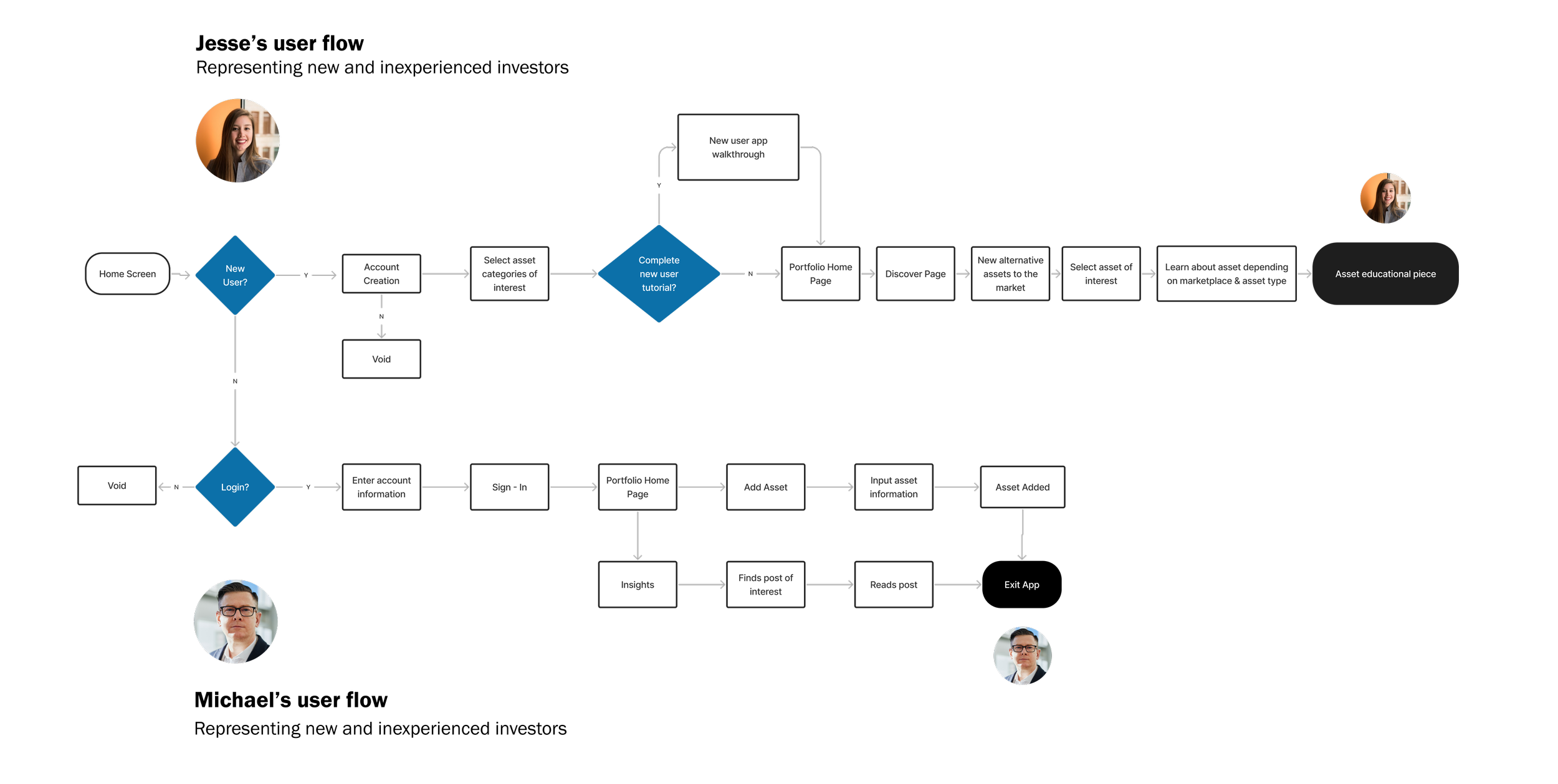
From the user interviews, we derived two personas who represent Altan’s mobile app’s target audience : Michael and Jesse and emphasized with their experiences by creating user journey maps.


Michael’s User Journey Map
Michael’s mood fell when he attempted to add an asset to the investment portfolio tool and was more frustrated when he tried to review the investment statistics.
All the existing users mentioned the current platform is not optimized for mobile.
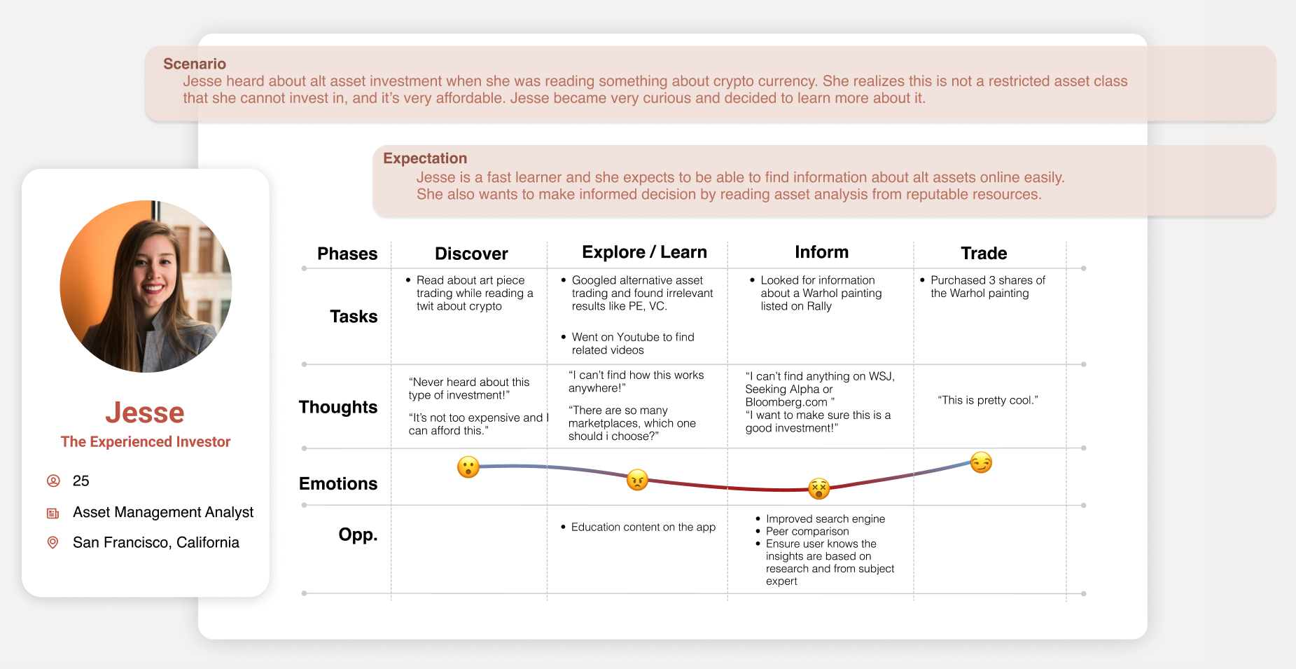
Jesse’s User Journey Map
Jessie tried to learn about alternative investing and only found herself confused and frustrated as there doesn’t seem to be a lack of reputable resources on this topic.
This sentiment is shared across all the potential new users we interviewed.
UNDERSTANDING THE MARKET / COMPETITORS
Altan Insights effectively fills a market gap, but there are opportunities for improvement in its current web platform: Lack of mobile optimization, education feature and user guidance.
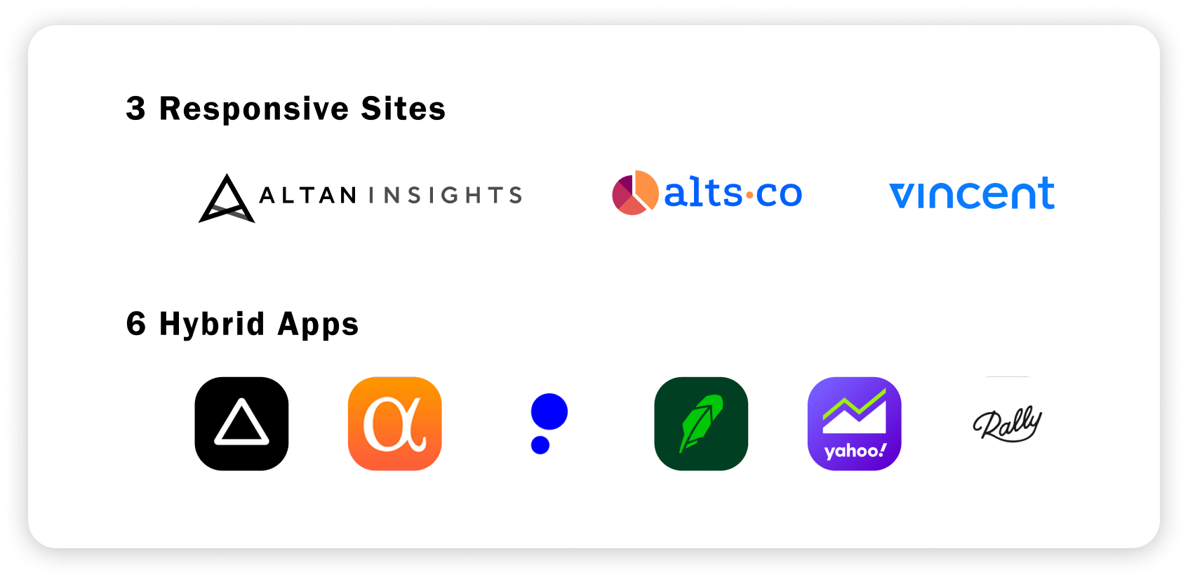
Method: We also conducted a comprehensive competitive and comparative analysis to benchmark Altan Insights to its peers like Alts and Vincent, and to more established products like Yahoo Finance and Robinhood. We wanted to learn the strength from the competitors and avoid potential shortfalls early on.
We compared Altan insights with 2 other responsive sites and 6 hybrid apps.
Insights:
Strength
Unique value proposition
Strong branding,
Delivers consolidated insights and information,
The UX writing is inviting and professional, and
The data manipulation features are desirable.
Shortfall
Lack of mobile optimization
Lack of education and
Lack of user guidance
DESIGN FOCUS
Our research revealed a desirability for mobile use and the current responsive mobile site is not optimized. We concluded that we needed to focus on three areas for the mobile app design.

CONCEPT IDEATING
We ran a design studio ideating solutions surrounding the areas of focus we identified
We created user flows from the perspectives of Michael and Jesse. Then started sketching and wireframing the screens.
TESTING + IMPROVEMENTS
We iterated our design after each round of usability tests and made various improvements.
Method: 2 rounds of usability testing performed on mid-fi wireframes; 1 last round of usability testing performed on high fidelity wireframes. The users were given 3 tasks to complete. We iterated our design after each round of tests.
Result: Of the 5 users tested, a majority were able to complete the designated task. There is an area for possible improvement through adding a swipe transition to the navigation menu since this is something that users expected to be able to do during testing.
Below are the improvement/iteration highlights based on feedback from usability testings.
“Current Asset” Slider
Before
→
After
Testers expressed that clipping the “Asset Name” will help avoid confusion
We also noticed multiple testers tried to find more details about the asset by clicking the asset photo - So we added click function to users access asset easily
2. Sign up options
Before

→
After

4/5 testers expressed that they were expecting social media sign up options
Upon further research, we noticed established finance apps like Yahoo Finance or Seeking Alpha support account creation using social media accounts
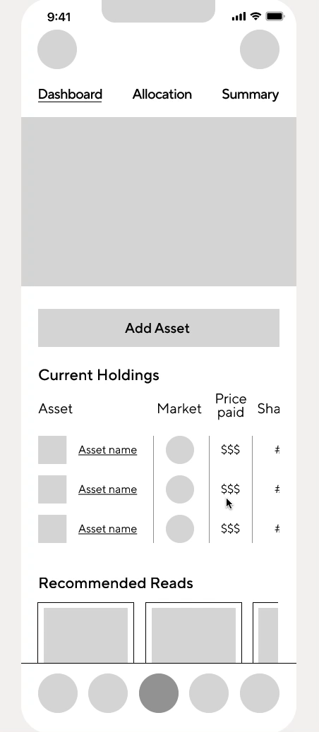
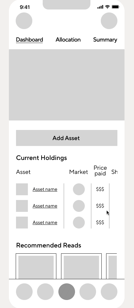
3. Portfolio Screen Changes
Before

→
After

“There are a LOT of information on this screen” - Testers
The line graph was simplified for a more minimal design and only present relevant information
We broke the screen into different sections and leverage more white space to help users focus on one group of info at a time
“Edit List” button was added so users can adjust their holdings
FINAL PRODUCT DEMO
REFLECTION
This was our group’s first client project. I am grateful for how open minded and supportive our client has been throughout the whole process. I also learned a great deal from my fellow teammates. This project would not have been as nearly done had we not collaborated and supported each other throughout.
Things we did right
We stayed aligned with our client from beginning to end through weekly meetings.
We let research be the foundation and tried to think intentionally about our design details.
We had usability tests done as soon as mid-fi wireframe was created to gather user feedback - A lot of design iteration happened based on the test results.
Things we could improve next time
Focus on one feature and dive deep.
Designing a whole app with many features is challenging. While we certainly learned a lot by tackling various parts of the apps, I also wish we had more time to work on the education page more.
Usability testing on paper wireframe.
We created mid-fi wireframe then conducted initial rounds of usability tests and iterated from there. However, if we had started iteration on paper, we could have been more nimble and make fast changes.
Explore different ways to visualize portfolio performances.
We adhered to the visualization methods currently present on Altan Insights’ platform in our prototype, if we had more time however, we could have explored more ways to present the data and investment performance that would have helped users digest the data better.